Lumic evolution continues
Posted: 25 Jul 2016
We're evolving!
Our evolution continues. With a slight adaptation to our branding, a new strategy in communicating to customers and a new website to suit.
After being in the IT and Communications sector for many years, our projects seemed to stem via word of mouth, which is a great testament to any business and how they operate. We didn't really need to market ourselves because our reputation grew on the back of our last project, but, we recognised that visually, we wasn't doing anyone any favours. We want people to get an instant impression on who we are. We want people to feel they can meet us before we step through their door, so this is when we decided to have a fresh revamp to all things Lumic.
The Lumic way.
Whenever we speak with customers we do so in a way which they will understand. Unfortunately the IT and telecommunications industry is full of jargon and abbreviated words that not everyone fully understands, so in order to combat this we try to provide analogies in order to break things down much easier. This helps when we are fixing issues as it allows customers to better understand what is happening and how we are tackling it. The general consensus of our industry is that it can be quite boring so we decided we wanted to bring a bit of fun and appeal to the tech and communications sector.
We're also growing as a company and now find ourselves all over the UK with a lot of partnered support being provided in Manchester, Birmingham and London, so it is important for us to project a modern and approachable outlook on Lumic. To help us showcase this vision we teamed up with North West creative agency Funkemedia
Sometimes simple is better.
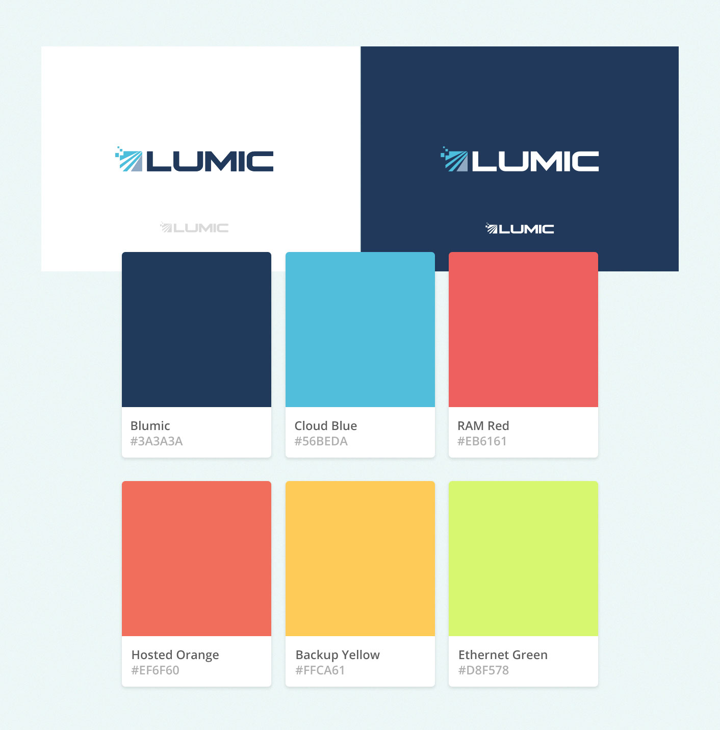
Our new logo isn't a million miles from our old logo in all fairness, we have simply removed the old gradient styles and replaced them with modern flat colours. Whilst the logo might not be to dissimilar, our corporate branding has taken a complete overhaul, with conscious considerations to typography, colour schemes and iconography.
Example of new branding:

This approach has already helped us to communicate with customers the way we want to without us coming across too technical and boring.
Our founder, Ricky Cross is a lover of simplicity and all things tech, and is known for his insightful advice to senior industry leaders. It was here he realised that people can find the IT and communications industry a bit of a minefield and recognised the need for change:
The top and bottom of it is that people just want the right solutions and to feel supported along the way. I wanted a new vision for Lumic that would see us as a breath of fresh air in the technology industry. Honest advice with language that people understand. I make a fuss on support because people we deal with tell me of their past experiences on how they have felt left in the lurch not knowing what infrastructure they had in place or not knowing what to do should there be any issues. We wanted to make sure that all our collateral going forward removed any confusion, was simplistic, up-to-date and highly visual. No nonsense IT, Infrastructure and Voice solutions that customers can understand but above all know they are supported along the way.
Ricky Cross, Director of Lumic Ltd
Digital transformation
After a lot of chatting, scribbling, researching, perfecting and designing, we're finally able to shout about our new website. Funkemedia produced a design that allows us to showcase our new ethos. They took onboard how we communicate with our customers and proposed a design that best suited this vision.
Making sure we have a great balance between text and imagery is always key. After speaking with Lumic about their vision, it was clear that they wanted to achieve this as well as positioning themselves in a better way, distancing themselves from stereotypical techy websites. Lumic took the time to get to know us as designers and developers and from the start we were all on the same page. Once we discussed writing the content in an active voice the design architecture came to life very easily. Projects where we are given creative freedom and feel connected to the purpose tend to be projects that achieve a better outcome. We feel we have deployed a website that is easy to digest, is more of a journey and represents the Lumic working model.
Kevin Cooper, Funkemedia Ltd
Our goals for the new website is to provide our visitors with a better experience when researching us as a company as well as looking at the solutions we provide. The result was a website our entire team can be proud of and a platform for ongoing innovation at a faster pace. The future of Lumic is bright and we are hoping to communicate that on a regular basis, right here in these news posts.


